

Data Highlight: Map Applications of the Internet
In many ways the internet is removed from our spatial reality. One Twitter user can retweet a post from another user halfway across the globe. Communities on the internet are often formed based on specific interests, not on geographic location. But, in other ways, our internet experience is shaped by the geopolitical atmosphere of our world. Domestic governance, relations between different countries, culture, and language still affect how we use the internet and who we interact with. Interested in learning about what these forces look like? The Net Data Directory offers a number of maps that can help.
The Digital Attack Map shows where in the world Distributed Denial of Service (DDoS) attacks are happening. The map indicates to the viewer from what countries attacks are carried out and in what countries attacks are experienced, as well as the volume and intensity of each attack. Sometimes only the place of an attack or the place attacks are being sent from is known, which is also reflected in the map. Below the map is a listing of major headlines of the day related to DDoS attacks, which can potentially help explain the current day’s trend of attacks. In addition the website has a collection of archived maps that show days in history with a high and unusual volume of DDoS attacks that are often associated with large cybersecurity events. Unsure of what a DDoS attack is and how it happens? Check out the webpage’s explanation.
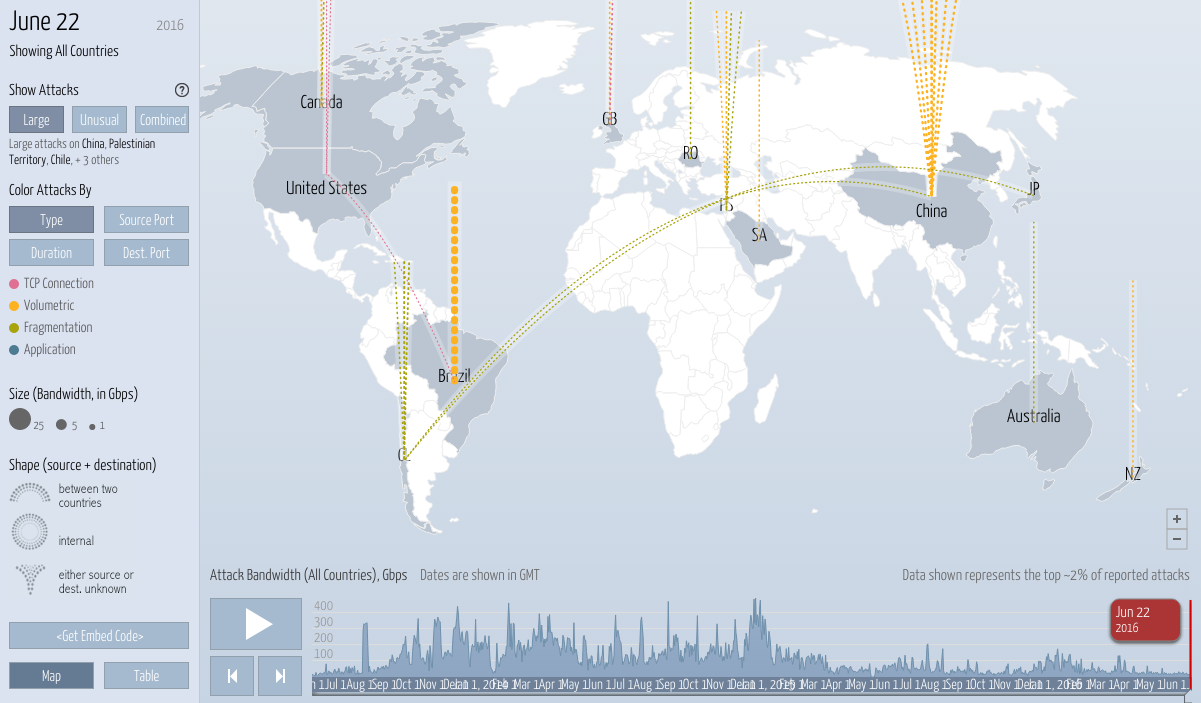
The screenshot above indicates the top ~2% of reported DDoS attacks for June 22, 2016. The viewer can see which countries experience the most attacks and which countries carry out the most attacks. The site itself is interactive, showing which direction the lines are moving (which indicates if a country is being attacked or doing the attacking), so be sure to check out the digital map. As an example, the large series of circles are leaving Brazil, indicating that a high volume of DDoS attacks are coming from Brazil.
Telegeography, which labels itself the authority on telecom data, has a number of maps that show the relationships between geography and communication, whether it telecommunications-focused or interaction on the web. The Global Internet Map shows how international data routes connect hub cities in the world and provides insight into regional bandwidth capacities. The map shows the highest capacity routes between the US and Europe and among various countries in Europe itself. Other maps include the world’s network of submarine cables, global voice traffic, and visual information on Internet exchange points.
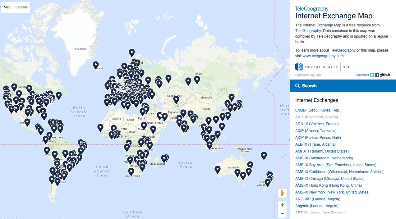
One of the many maps on Teleography is an interactive map that shows Internet Exchange points across the globe. An Internet Exchange point (IXP) is a physical network access point through which major network providers connect their networks and exchange traffic. The Internet Exchange points are provided in list form on the right hand side of the map.
Herdict, a project of the Berkman Klein Center for Internet & Society, demonstrates on an interactive map reports of website unavailability across the globe. Each country on the map has two circles, one that shows the number of reported available websites and one that indicates the number of reported unavailable websites. Below the map, the top reported countries are listed, along with a visual that shows how many websites are reported available and how many are reported unavailable. The top three reported countries right now are China, Vietnam, and the United States. The top reported URLs are www.youtube.com, www.facebook.com, and twitter.com. The map relies on data that users contribute; the aggregate data collected is the verdict of the herd—the Herdict.
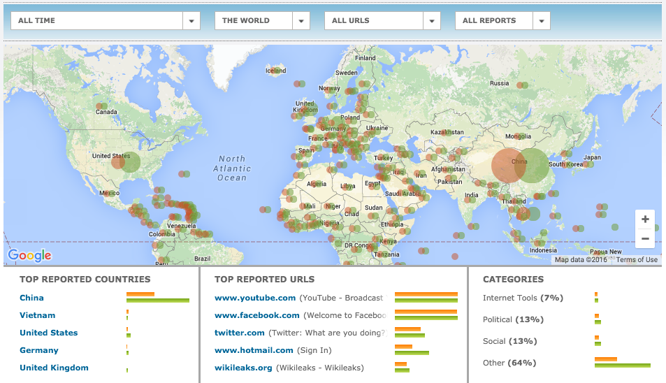
The interactive map of Herdict is captured above and shows the number of available and unavailable site reports for all time. Data filtering features are included above the map, and below the map, the user can view top reported countries, top reported URLs, and in what categories URLs are reported.
Threatened Voices tracks where in the world online journalists and bloggers are arrested or are in danger of being arrested, based on research and reports from the Threatened Voices team. The map not only provides status updates of each blogger and journalist but also shows the total number of arrested or threatened bloggers that have been reported in each country. The platform allows users to submit cases of the arrest or threatening of bloggers if they aren’t already captured on the map. Threatened Voices is infrequently updated, but the platform has been highlighted on this post because of its features that can help you understand the scope of threatened bloggers, journalists, and activists around the world.
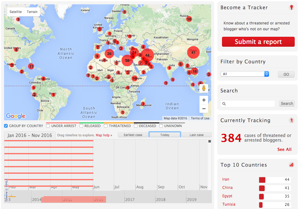
Above is a look at the Threatened Voice map on June 22, 2016. The number in each red circle represents the number of arrested or threatened bloggers in a particular country. The interactive map allows the user to filter by country, track the status of specific bloggers, and view aggregate data like the total number of threatened or arrested bloggers or the top 10 countries with arrested or threatened bloggers.
Be sure to check out these sites for a map-based look at our digital world! These are only a few of many data sources listed in the Net Data Directory that shed light on the geopolitical element of the internet.